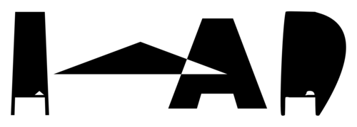
I was speaking with Jon earlier about my work and he’s noted that a lot of it has been text based and then asked if I was working towards making a typeface in the same style. I must admit, my recent text based work has mostly been an excuse to use the awesome Kawoszeh typeface, but I feel he’s onto something.
Whilst I’m quite far from a complete typeface I’ve been doing a few experiments:
Believe it or not that is the letter A glitched in the same way (replaced 9 with 15), but under different conditions. The reason for the above experiment is wanting to find the best environment in which to make the typeface. For example, the more nodes you have on a shape the more variance you get. The type of nodes that you have also has a major effect.
I’m also thinking about what typeface to use as a base. Being mostly Brummie I’m drawn towards hacking Open Baskerville although using just Arial Black provided some good results, as can be seen in my short glitch animation
I’ll have something produced next year and, should I finally do some coding, actually have a script to databend for me and make the whole process a bit more random!
