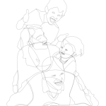
After seeing some of my recent work I was asked to do a family portrait. The last time I did a portrait on such a large scale was in 2007 in Adobe Illustrator and the last time I did a realistic portrait was probably back in 2006 of an old photographer buddy. I’ve been using Inkscape for just over a year now and whilst I’ve been doing little bits and pieces I haven’t actually done a major illustration.
As always I started with the outline first and filled it in with basic colours. I used GIMP and a very useful cutout filter to help me visualise how I was going to layer the colours and shapes that I needed. From there it was a simple case of refining and perfecting! Have a look at some of the progress shots:
The finished product looks like so and is probably my favourite piece this year:
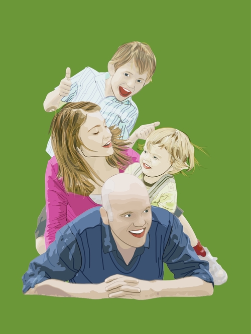
The finished result was printed onto a canvas and is mounted on their wall. Yay!
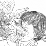
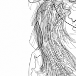
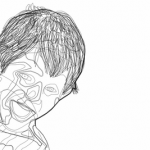
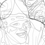
If you’re that kinda person you can have a look at the wireframe of the image:
Overall working in Inkscape was quite easy in terms of drawing. One bit of praise I often hear about it is its drawing and node editing tools, and it really did feel quite easy to draw this. However, there are two areas where I feel Inkscape hindered my creativity in creating this piece.
The first is how it implements brushes. Inkscape does this by using the Pattern Along Path Live Path Effect, which in some instances can be more useful than Illustrator’s brush tools. What I feel some users want is for the pattern to act as the stroke of a path and to still be able to edit the fill of a path. This would’ve been very useful for me when drawing the hair.
The second is it’s lack of extensive layer blending modes. Currently Inkscape has five layer blend modes, which includes normal/no blend and these can only be implemented on layers, not individual objects. As far as I know you were able to set the blend mode for each paths in 0.44, but it was removed for technical reasons. I achieved the effects in my earlier work by, at times, combining over ten different blend modes on individual objects. Take a look at this walkthrough by popular vector artist verucasalt82 and you’ll see why it can be quite handy. So, in the absence of blend modes for individual paths could we see a few more blend modes, overlay in particular?
With all of that said, you can see that Inkscape is still a very capable program. I overcame many of the problems I described by just doing things a little different than usual.
